Connection to Artist’s Books
The Smithsonian defines Artist’s Books as “a medium of artistic expression that uses the form or function of ‘book’ as inspiration.” The view of books as art objects began in the 20th century in Europe. Mid-20th century Europeans began to experiment with format, content, and binding techniques. An American named Edward Ruscha started the era of American artist’s books in the 1960s.
Three of the four books acquired are artist’s books: Mr. F, The Library of Lost Books, and This is not a Book. These three books are made by two small presses Angel Bomb Press (Mr. F) and Bo Press (The Library of Lost Books & This is not a Book).
Connection to Function
Mr. F was made in an accordion format to show both tellings of Frankenstein: one from Dr. Frankenstein and the other side from the creature’s perspective.
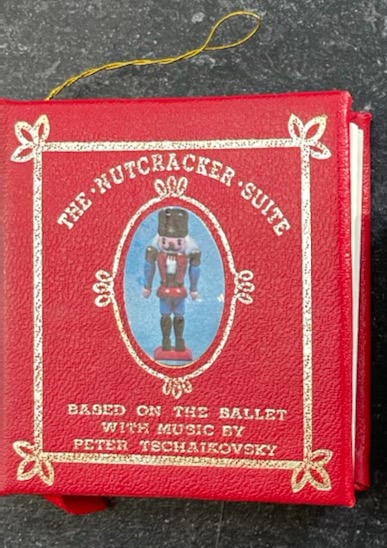
The Nutcracker is an ornament which explains why it is a miniature book. Since it is an ornament there is a small gold string loop to place it on the Christmas tree.

Visuals in the Books
A major reason that we purchased these four books was for their visual style. It was The Library of Lost Books that first jumped off the catalogue into our hearts like the other three books. What visual language do our miniature books communicate in?
Illustrations
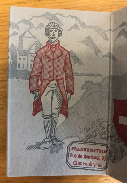
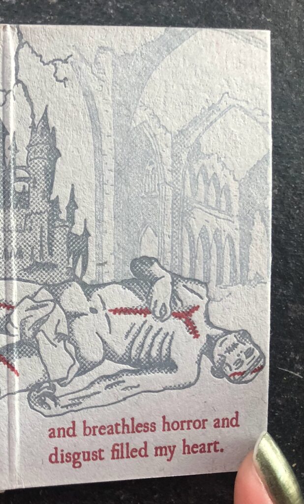
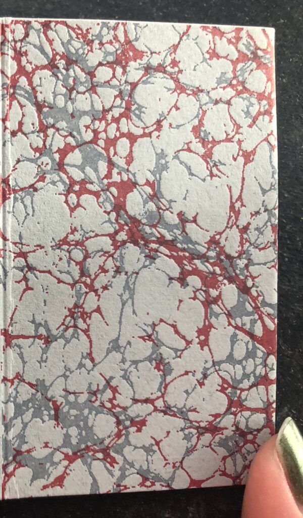
Mister F tells the classic story of Mary Shelley’s Frankenstein from two perspectives through the use of illustrations and text. One side of the accordion book tells the story from Dr. Frankenstein’s perspective while the reverse side shows the creature’s perspective. The illustrations in this book use a specific color scheme: red with various shades of grey. The same color scheme is used on the marbled pages that open and close the book. Red is used as an emphasis color to provide depth to the illustration against the greys as well as highlight elements related to the page’s narrative.

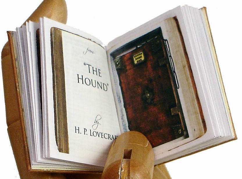
This is Not a Book does not have hand-drawn illustrations rather it includes photographs or scans of book covers. These book covers include the published book’s front and a book that only exists within the narrative. This is also known as the Droste Effect, an image being placed where it would be expected to be (in this case a book mentioned in the literature being inside the original book; a book in a book).


The Nutcracker does not include illustrations or photographs as the book is all text.
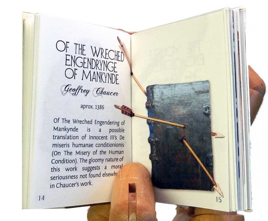
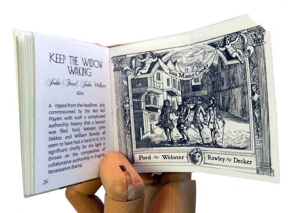
The Library of Lost Books has both illustrations and photographs.
Typeface
Mister F – Vergaguera by Chris Costello who also created Papyrus typeface
This is not a book – Does not have a singular typeface as it draws pictures from book covers therefore they vary by book.

The Nutcracker – Corporate E SC Demi by URW Type Foundry

The Library of Lost Books – Diehl Deco, Chopin Script, and Fontin Sans in order of appearance on the page. Diehl Deco is the largest writing “OF THE…” followed by Geoffrey Chaucer in Chopin Script and the following information in Fontin Sans.

Color
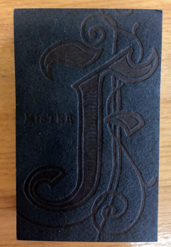
Mister F ‘s illustrations use a specific color scheme: red with various shades of grey. The same color scheme is used on the marbled pages that open and close the book. Red is used as an emphasis color to provide depth to the illustration against the greys as well as highlight elements related to the page’s narrative. However, the box that the book comes in is more of a blue-grey in certain lighting while the book’s cover uses a dark blue creating an interesting contrast to the red and various shades of grey used inside the book.


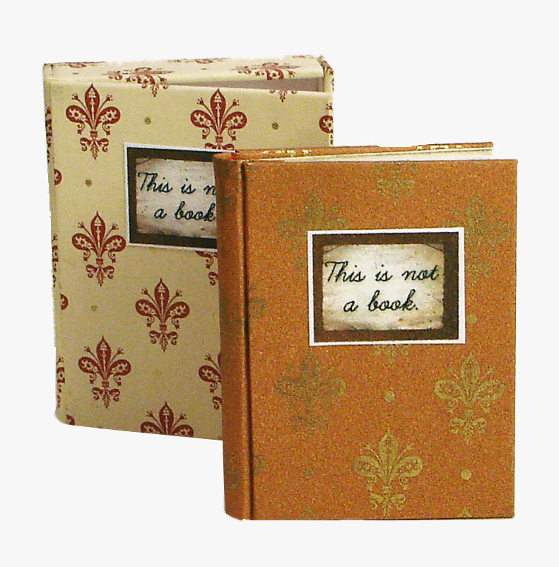
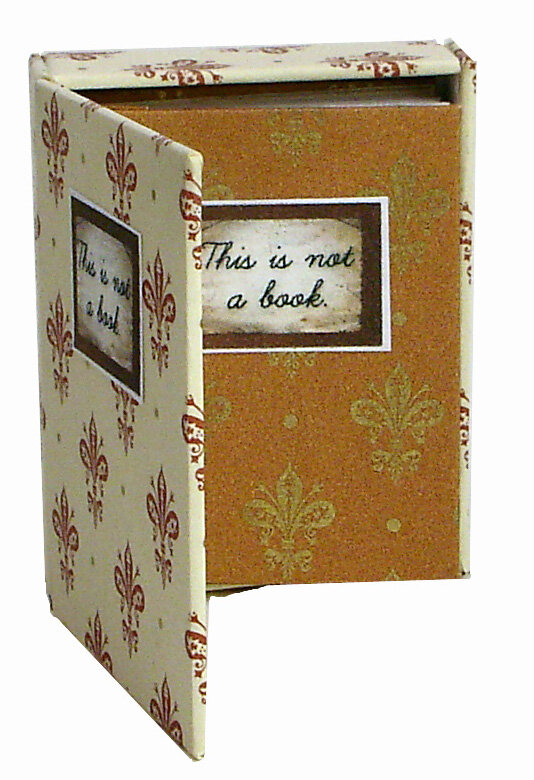
This is Not a Book plays with color between the box the book comes in and the cover of the book itself. Since the pictures within the book are taken from other published books, these colors are not included in this discussion. Between the box and the book, the color schemes are inverted. In the image, the box is the rust with gold behind in the creme and red book. Notice how the red fleur de lis on the book cover is gold on the book box.
The Nutcracker‘s use of color is more ornate than related to illustrations or the inside of the book. The cover of the book uses a vibrant red while the foredge – the paper visible when the book is closed – is faux gold-leaf paper.
The Library of Lost Books use of color is minimal. Most of the color, although mostly in a certain color scheme, comes from the photographs inside like This is not a Book.


Packaging
Mister F and This is Not a Book both came in accompanying boxes to hold the books.
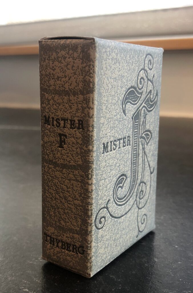
Mister F is held in a box that is designed to look like a hardcover book with a spine that has raised ribs – horizontal lines on the spine giving a 3-D effect. In fact, the box includes lines on the top, side, and bottom to resemble pages. The box also uses Vergaguera typeface as well as an incipit letter – a larger letter to mark the start of a sentence/passage; the verb “to begin” in Latin. The cover of the box replicates the actual cover of the book as well as the frontispiece – title page.


This is Not a Book is also held in a box meant to look like a book. This box is styled after the actual book as it uses the same format and design elements but has an inverted color scheme.